Friday, December 19, 2014

Behind the Scenes: Sketchbook Cover Painting


Wiener-Schmallow, my first painted sketchbook cover.

Closeup of new sketchbook cover painting called Wiener-Schmallow.

Painted sketchbook cover in my messy studio.

I've noticed that the legendary illustrator, Gary Baseman, often paints the covers of his sketchbooks. Sounds like a great idea, if nothing else so that you can tell one sketchbook from another. I've got dozens of filled sketchbooks and they all look the same, which makes finding a specific sketch a time consuming ordeal. Besides it sounds like a hoot and is something I've always wanted to give a try, but somehow never got around to doing. In fact, I've kind of abandoned the classic hardbound sketchbooks over the past couple of years in favor of cheap newsprint sketchbooks which I have been using with colored pencil for almost all of my sketches and layouts. I really like the look the bright colors on the newsprint and it has a really nice soft feel to it while drawing, too, unless your pencil is too sharp and pokes through the paper. I don't think I stopped using "real" sketchbooks as an intentional thing, it just kind of happened. I used to carry one with me at all times, especially on my daily trek to Starbucks, where I would sketch people and ideas for at least an hour every day. Sadly, the world's worst *barista was given the job of manager at my local Starbucks and has turned it into an absolute shithole, so I don't go in anymore—but I digress, let's get back on track and just say that somewhere along the line I started using newsprint pads and stopped using the hardbound "real" ones. The hardbound books give a nice organized record of sketches, notes and ideas in chronological order unlike the cheap news pads which tend to fall apart and become a sloppy pile of loose sketches, even if the individual pieces look cool, as whole they're a hot mess. So I decided it's time to get back to the real deal. I picked up a real hardbound sketchbook the other day and decided to christen it by painting the front cover, just something fun that wasn't part of a project or anything. I got out my acrylics and painted a piece I'm calling Wiener-Schmallow. It's generally based on the anthropomorphic food stuff featured in the old animated snack bar ads from the movies of yesteryear, and features an angry marshmallow with a barbecue fork menacing an irritated looking hot dog. If you want the back story, it seems that Mr. Hot Dog has been making time with Mr. Marshmallow's wife—obviously, Mr. Marshmallow is none too pleased. Overall, I'm pretty happy with the way it turned out, and I've actually started a digital version, although I've had to put on hold for the holidays and such, but it could still very well become the start a side project. We'll just have to see what 2015 brings.

Thanks for stopping by and checking things out.

Cheers!
Robert

*For legal reasons, I want to make it clear that I am NOT saying she is an incompetent, lazy asshole.

Monday, December 15, 2014

Christmas Card: Mid-Century Snow Scene


A Christmas card that I designed a little too late for this year (but should be plenty of time for 2015) featuring a quiet mid-century snow scene. I did versions in a number of other color schemes, but I think this one is the strongest.

Monday, October 6, 2014

WIP: Halloween Cards 2014 Part II

The original plan for the 2014 Halloween card line, was that I would have them printed up and do the shipping myself, but then I ran into some technical glitches (Windows 8 incompatibilities and whatnot) which put me way behind schedule. So now they will be released very soon through the brand new Wiles Side shop on Zazzle. The thing with Zazzle is that while their T-shirts are hit and miss, their paper products have always been high quality, and their turn around is pretty quick. That is why I'm opening the new shop. It will be featuring all new designs, which will only be available on paper products: greeting cards, invitations, business cards, etc. The old shop is still around because there are some fairly regular customers for some of the products, but nothing new will be added to that shop.

And now without further ado, here is a preview of the Wiles Side Graphics 2014 Halloween Collection.


Mod-Kitty Triumvirate Version #1
This design with the working title: Mod-Kitty Triumvirate is pretty much done, I'm just quibbling with myself over coloring and some minor design elements. During the MCM era the American public was mad about long necked slender kitties.


Mod-Kitty Triumvirate Version #2
This design with the working title: Mod-Kitty Triumvirate is pretty much done, I'm just quibbling with myself over coloring and some minor design elements. During the MCM era the American public was mad about long necked slender kitties.


Mod-Kitty Triumvirate Version #3
This design with the working title: Mod-Kitty Triumvirate is pretty much done, I'm just quibbling with myself over coloring and some minor design elements. During the MCM era the American public was mad about long necked slender kitties.


MCM Diamonds
This one is another a work in progress with a round of minor revisions still to come. The design was inspired by the diamond motifs that were a staple of mid-century design in nearly everything from cocktail napkins to the front doors of houses. As I mentioned in the previous design, these skulls are borrowed from the Wiles Side logo and are just for placement. They be replaced by something hand-drawn, maybe skulls, or perhaps a shrunken head, it's really too soon to tell.


MCM Bowling

Also a work in progress with another round of minor revisions to go. This design was inspired by the many mid-century bowling alleys that were all the rage back in the day, and are, sadly, becoming scarcer every day. These skulls are borrowed from the Wiles Side logo and are just for placement. They will probably be replaced by hand-drawn versions, or maybe zombies or something.


MCM Long-Diamonds and Dog-bone
Still a work in progress this design featuring long mid-century diamonds with a staggered dog-bone motif is at least one revision from release. The jack-o-lanterns are just for placement and will probably be replaced by hand-drawn versions.

Tuesday, September 23, 2014

Work In Progress: Halloween Card #1


Here is a sneak peek of a work in progress. This is the first of three Halloween card designs that I have been working on for 2014. This one is mostly done, just some color adjustments and such, the other two are being a little more stubborn but they’re coming along as well, and all three will soon be available in the WS Etsy shop, the WS Big Cartel shop and the brand new WS Zazzle shop.

Friday, September 12, 2014

Coming Soon . . . Halloween Cards

Holy Smacks! Can you believe we're halfway through September already? I'm in full-scramble mode trying to get a small line of Halloween cards done for this year. I plan to do this every year, but it seems that something always comes up to bugger things, and I never get them done. Well, something came up this year, too, nevertheless, I'm determined to offer up a small line, just three different cards, and it will be a pretty short run, too, probably only 50-75 of each. I haven't finalized all the details, and this next week is going to be crucial, so I probably won't be posting much, at least not until everything is set. If all goes well, I'll do it again at Christmas, and I'm also planning on thank-you cards, note cards and party invitations as well.


Monday, August 25, 2014

Stolen: Hellbetty Jewelry Inventory

For those of you in the PDX area. Sad news to report, one of my clients, Miz Tarrah over at Hellbetty Jewelry, has essentially had her entire business stolen. She makes upcycled domino jewelry and other trinkets and sells them online and at craft fairs and such, or at least she did. Her business was based out of her home and someone got into her house and took all of her inventory (see the flyer for details on what was taken). These are all handmade items and they took a lot of time and energy to create, so there's really no way she can get up and running again without recovering her inventory. She's already had to cancel the rest of her summer festival gigs. If you know anything or see anything please let her know.

Wednesday, May 14, 2014

Flyer Layout: Pinup Fashion Show

I recently ran across this Peter Driben pinup girl and when I realized she was in the public domain, I had to do something with her. So here is a flyer for a non-existing pinup fashion show. Neither of the businesses exist, nor does the address or the featured pinup models who are mentioned. I made it all up. In other words, this is just Adobe Illustrator CC practice, but I had fun designing it, and I'm pretty pleased with how it turned out.


Sunday, May 4, 2014

WIP: Mid-Century Thank You Note Design


Still getting used to the new computer and the new version of Illustrator, but it is coming along. Kicking around the idea of some Mid-Century themed thank you notes. This is still a little rough and unbalanced, but I think you can see where it's headed.

Thursday, May 1, 2014

Tumblr Blog Logos

I mentioned a CorelDraw experiment a while back, and I have to admit it failed miserably. I didn’t realize how much I had been depending on the keyboard short cuts in Illustrator without even thinking about it. Most of the Corel shortcuts are either different or gone completely, I don’t know if you’ve ever accidentally put on someone else’s pants before, but it was kind of like that: weird, awkward and a bit disorienting. So to make a long story short I’ve moved on to the Adobe CC Suite—just Illustrator and Photoshop for now—and the above are some Tumblr blog logos I’ve done to help me get back into it. There are quite a few changes with the new version of Illustrator, too, but at least I know the overall package, so I imagine I’ll be going with the full subscription soon.


Friday, April 25, 2014

Googie Pool House on the Oregon Coast


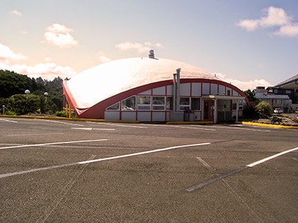
Lately I've been taking care of a lot of personal domestic stuff, as well as learning a new operating system (since the demise of Windows XP earlier this month) but since Windows 8 doesn't support most of the old programs I've been using and a lot of the equipment, too, I've also been figuring out work-arounds and learning  new versions of Adobe Photoshop and Adobe Illustrator, so not much art or design has been getting finished, but there should be some coming in a few weeks or so. In the meantime, here are some reference shots of  a charming little piece of mid-century architecture that looks like it came straight from an episode of The Jetsons, but can actually be found on the Oregon coast in Lincoln City. It’s the pool house at the Surftides Resort, which was originally an apartment complex back in the 50's, although that was long before my time. When I was a kid we stayed here during a number of family vacations, and I’ve got many fond memories of it. They used to have the coolest restaurant built into a cliff over looking the beach. It was called Over the Waves and featured a semi-circular building with a specatular view of the coastline from Cascade Head down to at least Siletz Bay. There have a been quite a few changes since then, but it is still a pretty nifty place to stay—it’s kind of away from all the hub-bub of downtown Lincoln City (yes, that really is a thing), but still close to restaurants, shops and such.

Thanks for stopping by.

Cheers!
Robert

Wednesday, March 12, 2014

Beach Sketch: Me & Sugar-Doodle


Here's a sketch (pencil, walnut ink, India ink, pen and white gouache) of me and Sugar-Doodle marveling at the ocean at the beach last week. We were staying in Nelscot, but the tide was so far in that we couldn't walk on the beach in front of our motel, so we had to drive down to the Dee River Wayside. It was worth the drive though.

Sunday, February 23, 2014

Stepping onto the International Stage


Ladies and gentlemen, I’m proud to announce that Wiles Side Graphics has now officially stepped onto the international stage I just licensed this old classic Devil Eightball image (from 2006) to a pool league in Australia for their uniforms.  Woo-Hoo!!!

Friday, February 7, 2014

Self-Promo


It has been a cold and snowy day in these parts, so I've been playing with the new logo and some old elements. I think this—or a variation of it—is going to be the back of my new business cards. This is a slightly darker red than I'm currently using, I'm not sure what I think of it yet.