Friday, December 8, 2017

Wiles Side on Etsy

Re-launching the Wiles Side shop on Etsy this weekend. I'm starting off with these mid-century snow scene printable art instant downloads, which will be followed by the Wiles Side Christmas Card Favorites Collection also as instant downloads. From there I'll be launching some new designs as well as some custom graphic services.
https://www.etsy.com/shop/WilesSide…

Saturday, March 4, 2017

Sneak Peak: Fat Bob's Hair Goo


Not a real product, but if I were to market my own pomade this is how the packaging would look. I have 17 variations on this design (plus some sketches), but I think this one is the winner, or at least close to being the winner, it may still need some tweaks and adjustments, I won’t know for sure for a day or two. I usually try to let a design sit for a little bit before I call it finished, so in a few days I’ll either fix it or call it done and put it in my portfolio.

Saturday, March 26, 2016

ThrillsVille Lost


Quite some time ago I had a blog going called ThrillsVille Deluxe which I abandoned in 2011, it was just becoming more of a chore to keep up with. I came up with an illustration as a header for the blog way back when and I was pretty pleased with it, in fact, it’s still in my portfolio as of this writing, but this new one may be replacing it soon, I haven’t decided. Anyway, I was going through some old files and came across a version that was a rejected roughs, but I still kept it. I had completely forgotten about it, but when I ran across it I decided to finish it up and see how it came out, and this is the result. It was inspired by a place my family used to go on the Oregon coast called The Surftides, it had some really cool mid-century architecture, including an amazing restaurant called Over the Waves, which is sadly gone now. Actually, most of the cool stuff has been refurbished, but the pool which is similar to the building in the background is virtually unchanged, and is just as cool as you can imagine.

Friday, March 25, 2016

Tiki Head Revisited


Lately I’ve been revisiting some old works and re-working them. I just finished this one—although a few things may still need refined—it’s from 2010, and was inspired by a gouache painting I did for a tiki art show (as far as I know the original is still hanging in someone’s home tiki bar somewhere here in PDX). I changed the colors and completely re-did the background. I’ll have a few more of these updated pieces in the coming weeks.

Wednesday, December 30, 2015

A Little Las Vegas Neon Boasting


The Bombshell neon. Image courtesy Melissa Black, used with permission.

The Bombshell logo I designed way back when.

Hey kids! I’m just doing a little shameless boasting here. A few Years ago I did a logo for a company called Bombshell Brazilian in Richmond, Virginia,  they’re a chain of salons which  specialize in the waxing of various bits and pieces, as well as hair, nails, etc. Over the years I’ve done  quite a a few other projects for them. Anyway, since I designed that logo they’ve opened 2 more locations, won more awards than you can shake a stick at, and now they are getting ready to dance on the national stage when they open their newest shop located across the country in Las Vegas, Nevada.  Which brings me to the boasting portion of today’s post, I recently heard from, Melissa (one of the owners) that they are installing a neon sign based on my original logo design, and I couldn’t be more pleased because after all,  what is Vegas without neon? It’s a big, dark city in the middle of the desert, that’s what.  I’m really excited because this is something I’ve never seen before, despite all of my years of designing in the retro vein I have never seen one of my designs in neon. It’s going to look incredible when it’s lit up at night, and I can’t wait to see it in person, although I’m not sure when that will happen, it will depend on what 2016 throws my way. In the meantime I would just like to congratulate Melissa and Scott Black on their spectacular and well deserved success. The final date for the grand opening hasn’t been set yet, but I believe it will be in mid February. So if you find yourself in Las Vegas stop in and say hello and have a look around and tell them I said “hey”.

Saturday, December 19, 2015

WIles Side Graphics Logo for 2016 (WIP)


Here is a behind the scenes look at some of what I’ve been up to lately. I’m reworking the WSG website for release in in 2016, and in the process I’ve been kicking around some new logo ideas. I’m pretty pleased with this one, not finished my any means so it’s still a work in progress, but I like where it’s going. I Really like this new color scheme, too—although the shade of blue may change before the final version is debuted. I’ve been using black and red for such a long time now that I think blue my add a freshness to everything.

Thursday, December 17, 2015

Molokai Gardens Design Revisited

Tonight I revisited an old design I did a few years back (2011, I think). The overall design is intact, it still features a combination of vintage clip art with some digitally drawn elements. I did change the colors and the fonts, but other than that I just played around with some things.

Wednesday, September 23, 2015

Fall Graphic Design Sale


Wishing you and yours a very happy first day of autumn 2015, and what better time to start a fall sale? Check it out! 10% off all custom design work: logos, business cards, postcards, posters, custom illustrations, etc. Just shoot me an email for details or a quote.
Cheers!

Sunday, August 30, 2015

Wedding Collateral Art


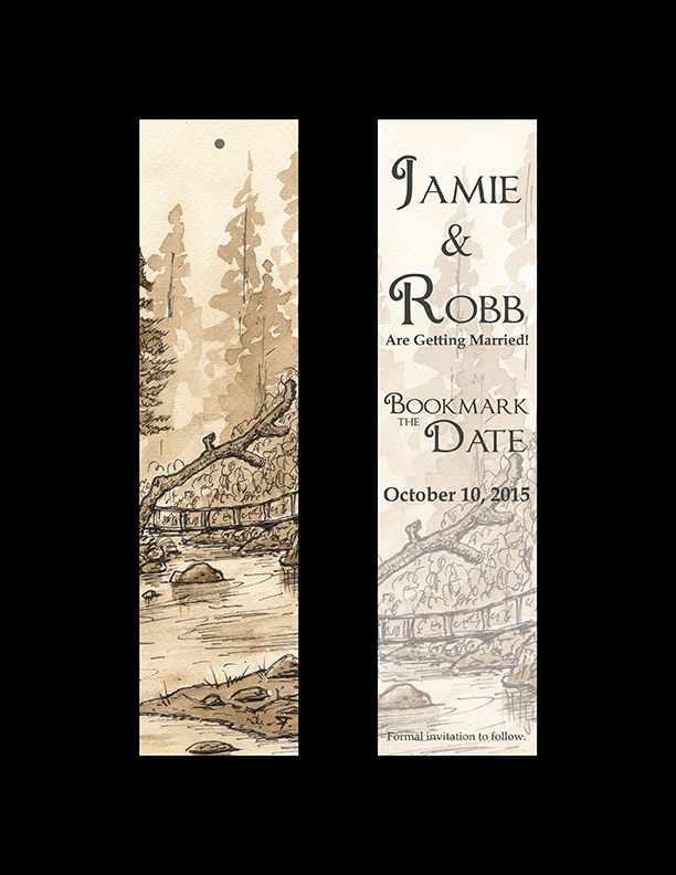
This is the final wedding art for all the collateral. Line and walnut ink wash. Everything should be going to the printer on Tuesday, except the banner and the thank you notes.

Monday, July 6, 2015

Logos: Archie Thompson Entertainment and Higher Calling Records


I recently finished an awesome project for San Diego jazz musician, Archie Thompson. The project consisted of two logos, one for his Production/Recording/Booking business, Archie Thompson Entertainment, and the other for a new record label he started called Higher Calling Records. I also did a set of double-sided business cards (not pictured), featuring each business on one side. This project was what I call trifecta, it was a blast to work on, it turned out great, and my client is really happy. I’ll probably be doing a more complete overview of the project a little later, but I wanted to get these out now because I just can’t wait.

Saturday, June 6, 2015

Wedding "Save the Date" Bookmarks


I’ve always considered wedding stuff to be a little out of my line, but when I got engaged to Doodle she really wanted me to do all the stationery for the wedding (save the date, invitations, thank you cards, etc) and she wanted it to be hand drawn. She really likes the walnut ink and pen landscapes I do, so that set the theme for the whole series. The bottom image is the original art work, which was cropped to fit the bookmark dimensions (8″ X 2″) for the front. The back is a cropped detail of the front with a reduced opacity to make an interesting background without competing with the text. The subject is the bridge at Eagle Fern Park out in rural Clackamas County, it’s a beautiful little patch of old growth forest that has been a destination of my family for as long as I can remember.

Wednesday, May 20, 2015

New Project: GSI Pawn Shop


I recently finished up a project for the GSI Pawn Shop in Tooele, Utah. My client wanted a sign for the side of his business, something based on the old gasoline logos of yesteryear. He knew exactly what he wanted and he even had a sign company working on it, but the text wasn’t coming out the way he wanted it, so he asked me to take over. Modern technology can only do so much, and when you want a certain look sometimes you have to get creative. It took some research and a bit of trial and error, but I enjoyed the challenge and learned a lot, and best of all, my client is happy with the final results. So pretty soon this will be a 5 ft. sign on the side of his building. I’m working on a couple of other projects right now, but when I get a chance I will give a more in depth overview of the process, or maybe even a tutorial.

Tuesday, May 5, 2015

Retro Thank You Notes Coming Soon!


Gadzooks! This has been a busy couple of weeks. I'm getting ready to relaunch the Wiles Side Etsy shop, so that should be coming later this week. I'm doing a soft-launch (basically just means I'll gradually be adding listings rather than everything all at once). Starting off with some retro inspired thank you notes. I've got 7 ready to go, but hoping to get 1 or 2 more done before Wednesday. Anyway, these will be available for instant download, you print your own as needed, or you can have them printed at your local copy shop. I've also got a couple of printing partners lined up, so I'll be offering finished cards soon—hopefully. Next up will be pre-designed business and profile cards, kind of template hybrid. These will be followed by a pre-order T-shirt, probably of the tiki persuasion, but it still isn't set in stone. I'm also thinking of re-launching the Wiles Side Zazzle shop, too, but I'm still kind of irritated with those bastards —so we'll just have to see about that.

Thursday, April 9, 2015

Rough Draft: Car Show Flyer

Just a rough draft, but you can still see where it's headed.
I’ve been working on re-launching the Wiles Side Etsy shop lately and have been working on samples for listings and such. So here is a rough of one of the flyer designs I’ve been kicking around. It features a 1955 DeSoto Firedome, which may seem a little obscure, but it is a sweet looking ride, and I think many of the more popular classics, the 55-57 Chevy Bel Air for example, have become clichés and are way over used. Although I would be perfectly happy to park one in my driveway. But back to the design, obviously it will need a few rounds of revisions—including completely re-working the car, but I think you can see where I’m headed with it. Oh, and just to be clear, this is NOT an actual event, and as far as I know the venue doesn’t exist either.

Friday, December 19, 2014

Behind the Scenes: Sketchbook Cover Painting


Wiener-Schmallow, my first painted sketchbook cover.

Closeup of new sketchbook cover painting called Wiener-Schmallow.

Painted sketchbook cover in my messy studio.

I've noticed that the legendary illustrator, Gary Baseman, often paints the covers of his sketchbooks. Sounds like a great idea, if nothing else so that you can tell one sketchbook from another. I've got dozens of filled sketchbooks and they all look the same, which makes finding a specific sketch a time consuming ordeal. Besides it sounds like a hoot and is something I've always wanted to give a try, but somehow never got around to doing. In fact, I've kind of abandoned the classic hardbound sketchbooks over the past couple of years in favor of cheap newsprint sketchbooks which I have been using with colored pencil for almost all of my sketches and layouts. I really like the look the bright colors on the newsprint and it has a really nice soft feel to it while drawing, too, unless your pencil is too sharp and pokes through the paper. I don't think I stopped using "real" sketchbooks as an intentional thing, it just kind of happened. I used to carry one with me at all times, especially on my daily trek to Starbucks, where I would sketch people and ideas for at least an hour every day. Sadly, the world's worst *barista was given the job of manager at my local Starbucks and has turned it into an absolute shithole, so I don't go in anymore—but I digress, let's get back on track and just say that somewhere along the line I started using newsprint pads and stopped using the hardbound "real" ones. The hardbound books give a nice organized record of sketches, notes and ideas in chronological order unlike the cheap news pads which tend to fall apart and become a sloppy pile of loose sketches, even if the individual pieces look cool, as whole they're a hot mess. So I decided it's time to get back to the real deal. I picked up a real hardbound sketchbook the other day and decided to christen it by painting the front cover, just something fun that wasn't part of a project or anything. I got out my acrylics and painted a piece I'm calling Wiener-Schmallow. It's generally based on the anthropomorphic food stuff featured in the old animated snack bar ads from the movies of yesteryear, and features an angry marshmallow with a barbecue fork menacing an irritated looking hot dog. If you want the back story, it seems that Mr. Hot Dog has been making time with Mr. Marshmallow's wife—obviously, Mr. Marshmallow is none too pleased. Overall, I'm pretty happy with the way it turned out, and I've actually started a digital version, although I've had to put on hold for the holidays and such, but it could still very well become the start a side project. We'll just have to see what 2015 brings.

Thanks for stopping by and checking things out.

Cheers!
Robert

*For legal reasons, I want to make it clear that I am NOT saying she is an incompetent, lazy asshole.

Monday, December 15, 2014

Christmas Card: Mid-Century Snow Scene


A Christmas card that I designed a little too late for this year (but should be plenty of time for 2015) featuring a quiet mid-century snow scene. I did versions in a number of other color schemes, but I think this one is the strongest.

Monday, October 6, 2014

WIP: Halloween Cards 2014 Part II

The original plan for the 2014 Halloween card line, was that I would have them printed up and do the shipping myself, but then I ran into some technical glitches (Windows 8 incompatibilities and whatnot) which put me way behind schedule. So now they will be released very soon through the brand new Wiles Side shop on Zazzle. The thing with Zazzle is that while their T-shirts are hit and miss, their paper products have always been high quality, and their turn around is pretty quick. That is why I'm opening the new shop. It will be featuring all new designs, which will only be available on paper products: greeting cards, invitations, business cards, etc. The old shop is still around because there are some fairly regular customers for some of the products, but nothing new will be added to that shop.

And now without further ado, here is a preview of the Wiles Side Graphics 2014 Halloween Collection.


Mod-Kitty Triumvirate Version #1
This design with the working title: Mod-Kitty Triumvirate is pretty much done, I'm just quibbling with myself over coloring and some minor design elements. During the MCM era the American public was mad about long necked slender kitties.


Mod-Kitty Triumvirate Version #2
This design with the working title: Mod-Kitty Triumvirate is pretty much done, I'm just quibbling with myself over coloring and some minor design elements. During the MCM era the American public was mad about long necked slender kitties.


Mod-Kitty Triumvirate Version #3
This design with the working title: Mod-Kitty Triumvirate is pretty much done, I'm just quibbling with myself over coloring and some minor design elements. During the MCM era the American public was mad about long necked slender kitties.


MCM Diamonds
This one is another a work in progress with a round of minor revisions still to come. The design was inspired by the diamond motifs that were a staple of mid-century design in nearly everything from cocktail napkins to the front doors of houses. As I mentioned in the previous design, these skulls are borrowed from the Wiles Side logo and are just for placement. They be replaced by something hand-drawn, maybe skulls, or perhaps a shrunken head, it's really too soon to tell.


MCM Bowling

Also a work in progress with another round of minor revisions to go. This design was inspired by the many mid-century bowling alleys that were all the rage back in the day, and are, sadly, becoming scarcer every day. These skulls are borrowed from the Wiles Side logo and are just for placement. They will probably be replaced by hand-drawn versions, or maybe zombies or something.


MCM Long-Diamonds and Dog-bone
Still a work in progress this design featuring long mid-century diamonds with a staggered dog-bone motif is at least one revision from release. The jack-o-lanterns are just for placement and will probably be replaced by hand-drawn versions.

Tuesday, September 23, 2014

Work In Progress: Halloween Card #1


Here is a sneak peek of a work in progress. This is the first of three Halloween card designs that I have been working on for 2014. This one is mostly done, just some color adjustments and such, the other two are being a little more stubborn but they’re coming along as well, and all three will soon be available in the WS Etsy shop, the WS Big Cartel shop and the brand new WS Zazzle shop.

Friday, September 12, 2014

Coming Soon . . . Halloween Cards

Holy Smacks! Can you believe we're halfway through September already? I'm in full-scramble mode trying to get a small line of Halloween cards done for this year. I plan to do this every year, but it seems that something always comes up to bugger things, and I never get them done. Well, something came up this year, too, nevertheless, I'm determined to offer up a small line, just three different cards, and it will be a pretty short run, too, probably only 50-75 of each. I haven't finalized all the details, and this next week is going to be crucial, so I probably won't be posting much, at least not until everything is set. If all goes well, I'll do it again at Christmas, and I'm also planning on thank-you cards, note cards and party invitations as well.