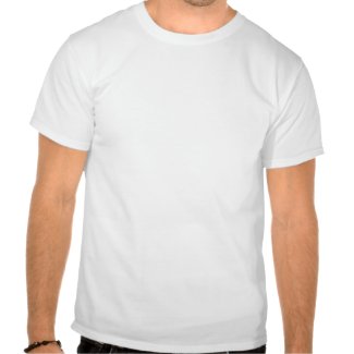
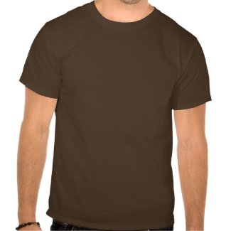
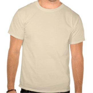
Holy Smacks! Summer is nearly hear, and you know what that means. T-shirt weather,of course, well actually as far as I'm concerned it's always T-shirt weather. Nevertheless, I'm pleased to announce that I'm kicking off the summer T-shirt season with a swell design inspired by the legendary Historic Route 66, sometimes called the Main Street of America. When it was first built in the 20's it stretched over 2,400 miles between Chicago and downtown LA, although it was later realigned because of traffic concerns so that it ended at the Pacific Ocean in Santa Monica instead.
Now, you can be the first on your block to own one of these beauties, the design is available in three color choices: black, cream or brown. But that's not all, because you can customize it to fit your taste. You can put your name on the back, resize the design, or change the shirt color. Go ahead and play around and see what you can come up with. Make it your own!
Black Design on a White Shirt
Cream Design on a Brown Shirt
Brown Design on a Natural Colored Shirt

Thursday, May 20, 2010
Wednesday, May 5, 2010
Hot Rod Brain Project
I've been planning this post for a while now, but I'm still not sure how to classify it exactly. It's not in depth enough to be an actual tutorial, but it's a little more complex than just a this is the final product post. I guess you could say this is a very brief overview of the many steps involved in an illustration project, for those who have ever wondered.
First Rough Sketch:
The project started when I was contacted by John, one of my Flickr friends. John does public relations and copywriting etc. and he was interested in having me do an illustration/design he could use on his web site and other collateral business items for his business Hot PR Shop . Now, John already had a really cool concept in mind, a hot rod with a brain for the engine, but if he hadn't I would have brain stormed and sketched out three concepts for him to choose from. But since he already had one, I did this first sketch based on a photo of a hot rod that he had taken at a hot rod show. At this point I wasn't too concerned with perfection, I just wanted to get all of the elements out there.

Second Rough Sketch:
Oh, I should probably mention that John and I are about 2,500 miles away, so this project was done entirely via emails and a couple of phone calls. Anyway, after I sent John the above sketch he told me what parts he liked and what parts he wanted changed. Notice that while the elements are the same at this point, yet this one is quite a different looking design. Everything is still fairly loose, I was just making sure we were on the same page.

First Digital Sketch:
In case you're keeping score at home, there were many sketches between this version and the previous one, although I didn't bother to count them, so I don't have an exact number. At this point I went from traditional media to digital and did this version based on earlier sketches. Actually, the process involved tracing parts of a couple of different sketches in Adobe Illustrator and then re-sizing the pieces to fit together. Of course, the best part about digital art is quick editing and the ability to save multiple versions.

Early Layout Version:
This version is an early layout featuring type. While we knew what text was going to be included, John hadn't decided on the final fonts at this point, so I put these placeholder fonts in to give him an idea of how the finished product would look. While this version is a lot tighter than previous versions, I was still experimenting with certain elements, specifically the grill/engine compartment area. Somewhere along the line, the pencil had been changed to a pen, which implies a writer more than the artist feel of the pencil. I also played around with some colors, such as the green brain, and I tried a simplified version of the flames (saving a copy of the original version just in case). I used the little squares of color on the left edge to make sure all the colors were the same throughout the illustration. It's surprisingly easy get get two shades of the same color going, which can cause problems further down the line.

Final Version:
And here is the final version: the red is just slightly darker, and it's a good thing I kept a copy of the original flames because those are the ones I used. The brain is a more healthy pink color, and the grill has been brought back up in height to about the size of the original reference photo. The text is set in the fonts John chose, and I've got myself a happy client, which is a really great feeling.

Well kids, I reckon that's about it for now, thanks for stopping by.
Cheers!
Sunday, May 2, 2010
A Little Shameless Boasting
Just last month I did a job for John over at the Hot PR Shop. Well, I'm happy to tell you the he was pleased with my work, so he wrote a really nice testimonial for me, and I just wanted to share it. Thanks for the kind words, John.
And now without further ado, my first happy client testimonial. Woo-Hoo!
"Robert did a logo and some related design work for me. I got great work from him that was done in the most professional manner. Robert strove to make sure I got what I wanted (and I did), along with making changes quickly. In addition to being talented, Robert is something many designers are not - dependable. I couldn't be happier!"
For those of you keeping score at home, yes, I have mentioned doing another post on the process of the project I did for John, and I will indeed be doing that post, I'm just getting a few other things taken care of first, but it will be coming soon.
-Cheers!
Subscribe to:
Comments (Atom)