Saturday, December 31, 2011

The Last Post of 2011

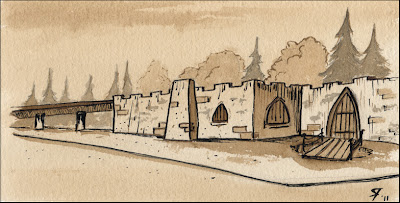
This drawing of the now gone Castle restaurant in Gladstone, Oregon is a walnut ink wash with a bit of pen & India ink. I did it from memory, so I know it isn't exactly correct, but it's really just a study, and I'll revisit the subject later for a more correct rendition.

As I recall, the Castle started out as a lapidary shop in the 20's and was later converted to a roadhouse in the late 30's or so. In the 40's and 50's it was a very popular jazz club in the Portland Metropolitan area. My dad remembers drunks falling into the moat outside, and visiting one time in particular during the mid-40's and there being buckets on the dance floor to catch leaks from the roof; the dancers just danced around them. Can you imagine the insurance liability today? In the 70's my parents and I would go there for dinner once in a while, the food was fantastic, not healthy mind you, but oh, so tasty. Sadly The Castle was closed down for good sometime in the late 80's or early 90's, and allowed to decay quite a bit. A few years ago a local business man, Jim Raoke (owner of the landmark, Roake's Footlong Restaurant) tried to re-open it as a restaurant, but the grandfather clause on the zoning had expired due to lack of use, and the neighbors put up a big stink about letting him do it for fear that he would open a strip club (despite Roake offering to sign an agreement that he wouldn't). Fucking imbeciles! The result was that the Castle was razed and replaced by a small housing development of shitty looking, cookie-cutter houses, called Castle Park. Sigh.
-
Walnut ink  drawing of the Castle Restaurant (demolished) in Gladstone, Oregon

Well kids, it looks like yet another year is coming to a close, so this will probably be the last post of 2011. This has been a turbulent year, full of tough choices, sacrifices, and sad losses (R.I.P. Pete). There were even a couple of times that were just flat-out scary, yet somehow I made it through. Having said all that, I don't think I would trade any of it for anything, because along with the bad, I have learned a great deal about myself, truly testing my limits from time to time. Not pleasant, but certainly valuable. I also picked up some truly awesome clients this past year and would like to thank them all for giving me a chance to work for them, and thanks also  to you readers for stopping by and taking a look at my blog.

And now, I propose a toast to us all:  
Good health, prosperity and better times in 2012. Cheers!


Thursday, December 15, 2011

Bombshell Logo Project

I just wanted to do a little boasting about this logo project I recently finished up for the Bombshell Brazilian Waxing & Beauty Lounge in Richmond, Virginia. At this writing they haven't changed over their website yet, and I'm also working on some images for their Facebook page, but this is a sneak preview of things to come. Not only that, but I did a logo for Pop Rocket Cosmetics, which is their new cosmetic line that will be coming out soon as well. I'll be posting about that one a little later.


Christmas Sketches

Earlier I was trying to get myself into the holiday mood with some Christmas sketches.

The classic snowman.

A Christmas stocking.


And of course, Santa Claus.

Tuesday, December 6, 2011

Happy Birthday, Randy Rhoads

Many years ago, back when I wanted to be a musician, I was hugely influenced by the phenomenally talented guitar virtuoso, Randy Rhoads. He would have been 55 today if he hadn't been tragically killed in a small plane crash back in March of 1982. While his influence on me was initially musical, I have to think that somehow he has influenced me artistically as well, if nothing else, just because he had such a huge impact on me when I was younger.

There has been a great deal written about Randy and his talents, his incredible tone, his fluidity, dedication and so fourth, so I don't think I can really add anything that hasn't already been said, and even if I could, nothing I could say would speak as well about him as his own playing. So here are three examples of his talent, all of them live versions recorded from the soundboard for top quality. And now without further ado, I propose a birthday toast to Mr Rhoads: happy birthday, and thank you for the inspiration. Cheers!


I know this is pretty late in the day—in fact  it is already too late on the East Coast—but, I have been putting this off all day, because I've been fighting the urge to go off about the shabby treatment of Randy's recorded legacy by the shit-weasels, Ozzy and Sharon Osbourne. However, I don't want to sully something honoring Mr. Rhoads, so I'll  leave most of that for another post at another time, but I will say that I hope both Osbournes get exactly and precisely what they deserve. And in case you're wondering, it's a long story, but briefly, in an effort to screw the original drummer and bass player out of their royalties, the Osbournes re-recorded the bass and drum parts for the first two albums with different musicians and erased the original work, then re-released the albums. While Randy's amazing work was left intact, it is now diminished, tied to musicians he never worked with, and that he had never met, all for the greed of two very pathetic individuals.

Wednesday, November 9, 2011

Mid-Century by the Bay Flyer Project

It's been far too long since I've posted here, but I've been busy with a flurry of projects. Some of these projects are are still in progress, and one of them needs to stay under wraps for now, however, I can tell you about the new promotional flyer design I just finished up for author, Heater M. David. She will doing a book signing next month for her recent book, Mid-Century by the Bay. If you're lover of San Francisco, or Mid -Century architecture then you owe it to yourself to take a look, and if you're going to be in the Palo Alto area on December 3rd, you can meet her in person and have her sign a copy of for you. It would make a tremendous Christmas gift for yourself or for the retro fan on your list.

As for the design, Heather wanted something fun, yet still elegant and classy, and of course, there had to be an MCM feel to go along with the subject of her book. I started with a clean white background to help keep it quiet, then added a couple of  nice retro fonts, specifically: Mister Television and Dairyland from Font Diner. I believe they're both in the set called Casino Buffet. For the date and time section at the bottom, I chose a great vintage looking sans-serif font called News Gothic. It was also very important to have the cover of the book featured, and I used a classic grid pattern for the layout, which is similar to the book's cover. I then filled in a couple of the other sections with images taken from the book. To balance out the design I sampled colors form the book cover for the information blocks, set the type in white, and then used those same colors in the display text at the top. Originally, the top space also featured some retro looking sphere shapes, and while they had a really nice mid-century look to them, they were so heavy—even in a much lighter blue color—that they overpowered the design, so we took them out. But then there was a bunch of airy white space with the text floating around in it, basically it was unbalanced in the other direction, so Heather asked me to try some sputniks similar to the ones on her website, SV Modern. It was a good call,  they added a nice retro look not too heavy, but not too light either. And there you have it.


All photos used in this design are copyright Heather M. David.

Friday, October 28, 2011

October Business Card Special Ending Soon!

Hey Kids just a reminder that the October Business Card Special, featuring the design and 500 double-sided full color professionally printed business cards for $99.95 is ending soon. Oh, and did I mention the free standard US shipping?

Have a Safe and Happy Halloween!

Order Yours Today!

Friday, October 21, 2011

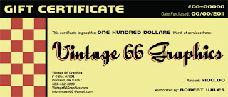
Gift Certificates Coming Soon!

Coming this holiday season!
Later this month I will be offering gift certificates for graphic services this holiday season. I'm still working on the Gift Certificate page for the website, and there will be more details to come, but basically you'll be able to purchase any denomination you want to give, or you can get one of the business card package deals that includes the design, printing and US shipping. Packages start at as few as 100 cards, and go up to 10,000 or more. What a great gift for that hard to shop for small business person on your list.

Oh, and in case you're wondering, yes, I've also been playing around with a new  look for Vintage 66 in 2012. What do you think?


Saturday, October 15, 2011

Coming Soon: Hellbetty Apparel

I recently did the design layout and set up the files for a line of apparel from Hellbetty Jewelry. The lineup will include men's tees, double-sided ladies tees and boy shorts undies for the ladies as well, although one would think they would be called girl shorts. Anyway, everything should be coming from the printer soon, and I will keep you updated on that and where you can get yours. In the meantime, here's a preview.

Men's Hellbetty Jewelry T-shirt.


Double-sided Ladies Hellbetty Jewelry T-shirt.

Boy Shorts from Hellbetty Jewelry.

Thursday, October 13, 2011

October Special: 500 Business Cards With Design Only $99.95

This month's special is for 500 full color double-sided business cards professionally printed on 16 pt. cards stock with your choice of a UV gloss finish or a dull matte finish. This includes the basic design and free standard US shipping via UPS. Order yours today!

Special Price good through October of 2011.

New Project: Moe's Mid-Century Modern Minneapolis Logo

Ladies and gentlemen, children of all ages, I am proud to present to you the retro logo I just finished up for Moe's Mid-Century Modern Minneapolis. Moe is in the process of opening up an Etsy shop and I will link sometime soon. For now, I'm just showing off a really cool mid-Century inspired logo that I am really happy with. We also did cartoon character versions of Moe and his cat, Cleo, which I will feature in a follow-up post that I hope to put up soon.

Thanks for stopping by.
Cheers!

Click for larger version.

Tuesday, October 4, 2011

Now Serving . . . Corn Dogs!

This is a sample promotional poster for a corn dogs. It is sitting here while I decide if it is ready for my portfolio or not, something I call the "cooling off period".  In the meantime, you can get one started for your organization or business right here.

Retro Corn Dog Promotional Poster

Sunday, October 2, 2011

Work In Progress—Tiki Girl

This is one that I got sidetracked on because I had some paying projects to work on. I hope to get back to her soon, but with the holidays rapidly approaching, it's hard to say when exactly that will happen, although now that I think about it, maybe I can work it into some kind of tiki themed Christmas deal. Anyway, this is the inked version that I scanned in and was working from.


Saturday, October 1, 2011

Work In Progress—October Pin-up Girl

I haven't posted lately because I've been busy on a couple of projects, but those are both winding down now, and I'm gearing up for the promotional part of some special offers for the month of October. I haven't done a pin-up girl in quite some time, so I thought this would be a good excuse, and, of course, this being October and all, I've decided to give her a Halloween theme. I should be back Monday or Tuesday with the finished results, but for now, here is a sneak preview of (for lack of a better title) the October Pin-up Girl.

This is the cleaned up sketch that I scanned in to work from.
Here is the digital version, which is about halfway finished.

Thursday, September 8, 2011

Sketches: Retro Heads

A four pack of retro cartoon heads from the almighty newsprint sketchpad that is always kept in my car. This was actually from a few weeks ago when I  got skunked on a Parking Lot Characters field trip—surprisingly none have shown up since the warm weather started, perhaps they've all migrated to Walmart for the season. Anyway, I drew these from my imagination just to be drawing something.


Projects: Hellbetty Jewelry Part II

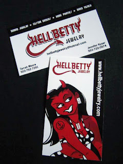
This is just shameless boasting, because I'm really proud of the Hellbetty Jewelry Project and happy with the way everything has turned out. The client is tickled pink as well, which makes me that much happier. Anyway, this is the latest batch of printed items hot off the presses, the T-shirts and the business cards.

Photo: © 2011, Tarrah Moore. hellbettyjewelry.com
Photo: © 2011, Tarrah Moore. hellbettyjewelry.com  
Photo: © 2011, Tarrah Moore. hellbettyjewelry.com

Tuesday, September 6, 2011

Behind the Scenes: Cartoon Tests

I've been working out an idea today, which is a variation on my cartoon style, but instead of  the usual ink, or digital, I'm doing it in black colored pencil and blue art sticks. The style I'm shooting for is reminiscent of the soft black & white children's book illustrations of the mid-century, such as those of the legendary, Syd Hoff. You might not think it, but one of the most important choices I've had to make to get the look I want is the choice of paper. To make a long story short, I did three versions on different types of paper to see which one looks the best. So now, without further ado, I present the three test versions.

#1 Charcoal Paper

#2 Cream Tinted Drawing Paper

#3 Cream Manila Drawing Paper
After playing the "Three Bears Game"—this one's too lumpy, this one's too smooth . . .—the one I'm happiest with is #3, the cream manila drawing paper. It's got a nice soft texture and an old school feel, you might even say an "antiqued" look to it. The funny thing is, that I found this paper at Goodwill, and parts of the top sheet were sun-faded, so it had obviously been around for a while. I'll probably never be able to find it again, in fact, after this test, I've only got 47 sheets of it left, which will be fine for this project, but what about the next one? I'll figure something out. If nothing else, I can always scan a blank piece of it and use as a texture for future digital art, so I'll at least be able to use it that way.

Thanks for stopping by.
Cheers!

Monday, September 5, 2011

Get Paid For Referring Clients to Vintage 66 Graphics!

At this point it is still unofficial, but I am now offering a finder's fee to anyone who refers new clients my way. Basically it goes like this, you tell somebody about the great services and products available from Vintage 66 Graphics, then let me know via email, and I will make a note of it. If that person ends up hiring me, I will send you a 10% finder's fee within three (3) business days of the client's final payment being approved. I don't want to imply you're going to become filthy rich by these referrals, a $50 job will only net you $5, for crying out loud. Of course, a much bigger $2,000 job will get you $200,
so it really just depends. There are a few limitations, for example, this offer does not include referrals to the Vintage 66 Zazzle Shop, although Zazzle already has an affiliates program in place, so you can get in on that too, if you like. Also, the job must be completed, meaning if the client cancels, there is no finder's fee. I'll be posting about this more when there is an official launch, but in the meantime, if you have any questions feel free to ask.

Saturday, August 27, 2011

Now Offering Professional Printing Services

I am proud to announce that I have recently added quality, professional printing services to the Vintage 66 Graphics menu of goods & services. Whether you need business cards, brochures or an outdoor banner, by going through Vintage 66, you can save gas, time and the headache of coordinating a printing job, and you'll get a great price in the bargain. In addition to a wide variety of products and surfaces, I can also get you silver ink, dull matte finish with spot UV and metallic inks. So the next time you need a printing job done think of Vintage 66 Graphics.

.


Wednesday, August 24, 2011

Traditional Art: Pink Flamingo Surfer

Here is a pink flamingo surfer dude in gouache and ink that I did for my sister for her birthday last week. I did have to digitally adjust the colors in some spots, there's a really a long, boring explanation about the CMYK mode vs. the RGB mode, but if you care you probably already know, and if you don't, it really doesn't matter, so I'll spare you the boredom and just say it's because that's the difference between digital and tangible art.

Thanks for stopping by.
Cheers!


Saturday, August 20, 2011

New Service Listings on Etsy

I've finally gotten the V66 Etsy shop squared away, I mean for the time being, it is a work in progress after all, like pretty much anything else in the Vintage 66 Online Empire (including this very blog). Anyway, one of the new sections I've added is for Custom Graphics, which features logos, business cards and even custom pin-up girls.Of course, if you want to skip Etsy, you can contact me directly for any custom work, and I do have more flexibility when working away from Etsy, just because I don't need to make a custom listing and can make changes without needing to re-list or update the listing.

You can get 5,000 business cards, including the design and US ground shipping via UPS for only $190. Save gas, save time and avoid the hassle of working with a printer.


How about a custom pin-up girl to help promote your business? One initial investment is well worth the cost of $225. She'll add sparkle and umph! to your flyers, T-shirts and whatnot.


And finally this listing is for a custom retro logo to help you brand your business, organization, or band and features up to two rounds of revisions for $350. This is the real deal made in the USA, not some mediocre, hacked out piece of crap from a cut-rate design firm that outsources their work to other countries such as Taiwan.


Thursday, August 18, 2011

Vintage 66 Now Offers Design and Printing Package Deals!

How's this for one stop shopping? Not only can you get killer business card designs done here at Vintage 66 Graphics, but I can also handle the printing for you and have your finished cards shipped right to your door. Man Alive! Talk about convenience. And in case you're wondering, yes, I can also do: stickers, brochures, T-shirt designs, folding table tents, postcards, event flyers, indoor & outdoor banners and more. You can get your project started by visiting this link.


Sunday, August 14, 2011

Projects: Hellbetty Jewelry Part I

I recently completed a really fun project for Hellbetty Jewelry, a small company that makes upcycled jewelry out of old domino tiles, Scrabble tiles, etc. When I say small, I mean just the two owners, Tarrah and Jen, a couple of crafty rock-n-roll moms with a passion for making really cool stuff, which they do completely by hand. Being this small gives them the opportunity to easily go in a number of directions without spreading themselves too thin, they sell at fairs and markets, as well as wholesale, they offer home parties, and do custom designs for the individual, but they also do band merch—for example, they did some really cool stuff for the local band, The Warshers. Really unique and creative stuff.

Originally they had an existing logo and business card design, but they wanted some tweaks, however, for a number of reasons, including the fact that we didn't have access to any of the original vector files, we decided to completely re-brand Hellbetty Jewelry complete with a new logo, new colors and the addition of a devil girl mascot type character, tentatively named Betty. At the beginning of the project I met with Tarrah for coffee and we went over what she was looking for, the people she was trying to reach, short term goals, long term goals and that type of thing. Once I had a good idea of what was needed, Tarrah pretty much turned me loose to see what I would come up with, you can see the results below. It was a pretty big project, so I'm going to split this into two different posts, this one, which is just a brief overview, and then the second post, which will go into the design process a bit more. I'll also be doing the corporate ID design on the Hellbetty sister company, HB Jewelry, which will focus more on sports team fundraising and family stuff, so there will be a third post when that is all done. And now without further ado, I present the Hellbetty Jewelry Project: Part I.

This is the logo, which is pretty straightforward. It's bold, and legible and the tail and horns give it just enough mischievous character to match the spirit of the company. There are three different variations: shadowed, red, and black, which will pretty much cover any given situation. 

This is Betty, the Hellbetty girl, I'll focus more on her in the next post, but she is such a big part of the ID that I couldn't leave her out of this one. There is a longstanding tradition of devil girl characters in lowbrow/alternative culture since at least the late 40's & early 50's when motorcycle and hot rod clubs (gangs?) first started using them in their logos, or maybe even the days of WWII, I believe I've seen photos of devil girls painted on the noses of a couple of bombers. Of course, they became even more popular when legendary underground comic artist, Robert Crumb unleashed his character, Devil Girl on the World.

The business card is truly the workhorse of any small business, even now in these modern days of eBusiness. This is the front and back of the Hellbetty business card. It's really cool because it offers the best of both worlds, one side features the traditional horizontal layout, while the other has a more contemporary vertical layout. The design is strong, bold and memorable, but most importantly, it's legible.

This is a tightly cropped version featuring the logo and and a head shot of Betty. It's intended for a square sticker, and while this version of the design is 2" X 2" we've got a vector version so that it can easily be increased to T-shirt size, or even as big as a billboard if necessary, with no pixelation or  loss of quality.

This is co-owner of Hellbetty Jewelry, Miz Tarrah posing with the outdoor banner (which is based on the website banner) and will be used for the Hellbetty table/booth at fairs and such. It's the piece that I am proudest of, if for no other reason than because it is so big!  It is 8' X 2' and I've never had a chance to see my work this large before.
Photo: Copyright 2011, Tarrah Moore. Hellbetty Jewelry

Thursday, August 11, 2011

Retro Inspiration: Vintage Luggage Labels

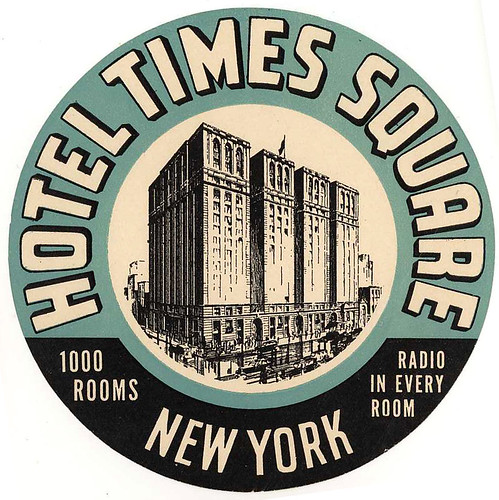
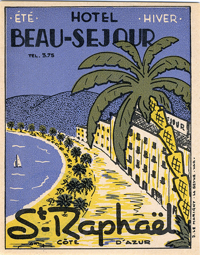
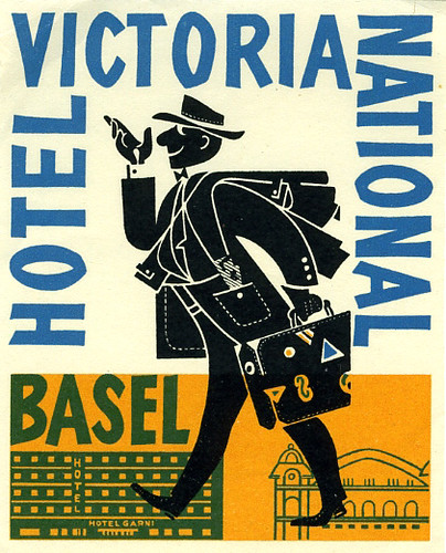
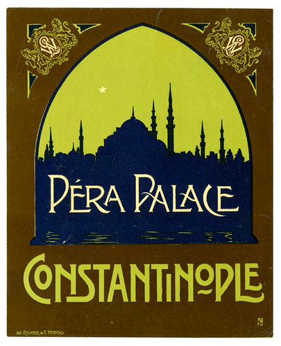
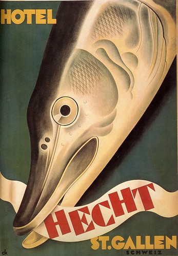
One of the great things about designing in the retro vein in the age of the internet is that there is so much material available for inspiration, especially with photo sharing sites like Flickr. No matter what time period fascinates you, somewhere on the internet you will probably be able to find at least a handful of examples to glean some ideas off of. That is the great thing about good design, it never goes out of style. It will certainly have the look of the time period, but if it was well designed in the first place it will look good through the ages. Case in point, I recently found a treasure trove of vintage luggage labels on Flickr. Many different nations and cultures are represented in this collection, and date wise they range from the late 19th century up into the middle 20th century. Below are a couple of examples, and you can click to explore the entire collection.

hotel times square new york


Luggage Labels

pera palace #560 Richter & Co

Charles Kuhn Hotel Hecht St. Gallen Poster

Tuesday, August 9, 2011

Watercolor: Pacific City

This is Haystack Rock at Cape Kiwanda in Pacific City on the northern Oregon Coast. There are actually two Haystack Rocks on the Oregon coastline, the other one is in Cannon Beach, which is about 65 miles north of Pacific City. Both of them are majestic and beautiful no matter the weather, and are well worth the visit if you find yourself in the area. Anyway, this was just a little watercolor practice I did over the weekend while taking a break from website updating. Some parts of it I'm happy with, others not that much, but overall I'm pleased. However, I should mention that I did warm it up a little bit with  the magic of digital technology just to make me a little more pleased. Thanks for stopping by.


Monday, August 1, 2011

Traditional Art: Old Beer Sign

This one is completely from my imagination, it's an old beer sign done in gouache and ink. I'm still fairly new to gouache, so there are a few rough spots in this one. I think I'll start offering original art in my Etsy shop after I get my chops up a bit more.

Cheers!


Wednesday, July 27, 2011

Summer Business Card Special

 Business card package deal promotion for Summer 2011. Get the design, printing and US shipping for one affordable price. These are high quality standard sized (2 X 3.5) business cards, full color double-sided UV coated or dull matte finish on 16 pt stock. Other quantities are available starting at as few as 100 cards. I can also get you magnet business cards, postcards, flyers, and much more. Just let me know what you're looking for.

Monday, July 25, 2011

Oregon Coast Watercolor:Twin Rocks

I just finished up this watercolor painting , which I am sending to my niece who is having a birthday later this week. She doesn't read this blog (at least I hope not) so it's not like I'm letting the cat out of the bag, and if you know her, don't tell her. Now she's living in Texas, so I chose Twin Rocks because of a childhood connection, oh and I should point out that she's only 6 years younger then me, so there isn't a huge age difference. My sister used to have a beach cabin on the Oregon Coast in Rockaway, which is just a stone's throw from the town of Twin Rocks. It was named for the two rocks (actually called sea stacks), although they really don't look like twins, more like a dragon or sea serpent, actually. Anyway, it seems like we spent quite a bit of time there when we were kids, especially in the summers, and this is one of my favorite views, and hopefully one of her's, too, so I thought I would send her a "little piece of home".

Twin Rocks looking south from Rockaway, Oregon.

Saturday, July 16, 2011

Lesson Learned: Don't Force It!

It may seem like an odd decision to highlight one of my mistakes on my professional blog, even if it was many years ago. But, as my old friend Pete often used to say: I've never learned anything from my successes, I've only learned from my failures. It's even better is if you can learn form the mistakes of others. This cartoon comes from back in 2003, it was my submission to a local newspaper's cartoon contest, and despite the problems it was my first published piece. That doesn't mean that I won the contest, it simply means I followed directions, so my cartoon was published on the newspaper's website in the honorable mention section (the whole article has since been removed) along with  the sixteen or so other cartoonists who also followed the instructions. I don't remember the exact contest requirements, but I think the one's who were disqualified all had size related/layout issues. The theme of the contest was Portland history, which I have a huge passion for, so it seemed like the contest was tailored just for me. However, as the deadline neared, I had talked myself out of doing it, (actually it was the cruel little voice on my head that did all the talking) but as luck would have it they extended the deadline because of a lack of qualified submissions. So I defied the little voice and went for it.

I have always had a fascination with the Hotel Portland, a beautiful 19th century hotel which should have been preserved, but sadly, was torn down in the 50's to make way for a parking lot—Seriously! Today the site is Pioneer Courthouse Square, Portland's Living Room, although they brought back some of the original ironwork, and the Starbucks on the square used some tiles from the original hotel for their floor, so at least some of it is still there. Anyway, I had this great idea about a mythical resident of the hotel who created a time machine and went forward 100 years to modern day Portland, only to discover the hotel was gone and the locals were rude and surly. I even had a great bit where he went to the rare book room at Powell's bookstore, and finds some of his books for sale. Well, as you can probably imagine the story came out to be about 8-12 pages of material, but I only had 4-5 panels to tell the story. So, of course, being the logical type that I am—yes, that's sarcasm, in case you missed it—I tried to jam all that material into a five panel cartoon, rather than coming up with a new theme or a different story line. The result is a disjointed story that really doesn't make a lot of sense, because so much of it had to be cut out. Lesson learned: don't try to force it. Artistically it is okay for the most part, but that single dark panel in the top corner with all the other panels being mostly light, throws the entire composition off balance. It would have been stronger if I had either used some darks throughout, or removed that big patch of dark all together. Oh, and I used the font Comic Sans, which is a crappy font even for cartoons. Well, that was a long time ago and I've learned a couple of things from the experience, and now, hopefully so have you.

Thanks for stopping by.
Cheers!

Not a complete failure, but it could have been much better.

Thursday, July 7, 2011

Parking Lot Characters: The LargeTopless Guy

I was nearly finished with this one before I realized just how much this fellow looked like a middle-aged Charlie Brown gone to seed. It was one of the first sunny days we had had this year, and I wasn't even all the way to my usual sketching grounds when I spied this gomer strutting down the main drag in downtown Oak Grove. This is what happens in Oregon after a cold and drizzly spring and early summer, guys like this feel compelled to take their shirts off and wander around at the first provocative hint of sunshine. Now as an artist and former connoisseur of nude dancing establishments I've probably seen well over a hundred miles of naked human flesh, some of it more pleasant than others, and I consider the human form to be a fascinating piece of machinery, and generally take each one as is. However, when I see sights like this it really makes me wonder about the über-conservative folks who get so offended by public breastfeeding. Seriously! A woman can grow a small human being inside her body, and then after it is born, use her body to feed that same little human. How amazing is that?! Yet, here we are in the year 2011 and despite a growing laundry list of the benefits of breastfeeding to both mother and child, there are still people who are offended by this act as if it's something dirty and shameful. Meanwhile, this character, and his ilk, like so many fur-less bears, can lumber down pretty much any Main Street  in the great US of A with nary a glance. I'm just sayin' it seems a little backward to me.

Thanks for stopping by.
Cheers!

A large topless guy strolling down the street.