Thursday, July 22, 2010

Introducing the New Vintage 66 Graphics Blog.

Greetings! The time has come to move the Vintage 66 News Blog  forward in an effort to help better configure my internet empire. I recently posted about the new Vintage 66 Graphics Website, which I'm really quite pleased with, and with the new service I'm using, I had the opportunity to add a blog to the actual website, and I really couldn't think of a reason not to. This blog will remain up, since one of the few drawbacks is that I don't have the ability to import these posts to the new blog, and I would really hate to just delete it after all the time and effort I've put into it. I'll check back in here from time to time in case there are comments or anything like that, but for now, you  will find the freshest V66 news here on the all new Vintage 66 Graphics News.

Thanks for stopping by.
Cheers!


Monday, July 5, 2010

New Shirts on the New Vintage 66 Web Site!

hile the New Vintage 66 Graphics web site is still in beta format, I have just added some screen printed T-shirts  for sale. These are actually what I would call proto-types and I honestly don't know if they'll be printed again after they're sold out. Why not swing on by and take a look.


Tuesday, June 29, 2010

New V66 Web Site Unleashed!

The beta version of the New V66 web site is up and running. Later this month, after I've worked out a few bugs and whatnot, I'll be mapping it to the Vintage 66 domain. I'll also be tweaking and updating it throughout the summer so there is lots of new, exciting things to come. Feel free to stop by anytime!

Wednesday, June 16, 2010

Shaken, Not Stirred.


This is the third in a series of self-promotional postcards I did for V66. I've utilized vintage clip art along with some retro fonts and design elements for an eye catching promotional piece. This style would be a great solution for any small business on a tight budget. Since I don't have to draw the characters from scratch, it saves time and money for everyone concerned, without having to sacrifice quality.

Monday, June 14, 2010

Come And Get It!


Got a hankerin’ for some of the tastiest retro graphics and design services on the range? Vintage 66 Graphics is serving up flavorful graphics for any size appetite from petite to hearty. You can choose a basic customized design featuring authentic vintage art or go with a unique and completely original cartoon, illustration or design. Get ‘em while they’re hot!

This is the second in a series of self-promotional postcards I did for V66. I've utilized vintage clip art along with some retro fonts and design elements for an eye catching promotional piece. This style would be a great solution for any small business on a tight budget. Since I don't have to draw the characters from scratch, it saves time and money for everyone concerned, without having to sacrifice quality.

Friday, June 11, 2010

Now Serving


Vintage 66 Graphics is now serving up some of the most delectable retro graphics and design services around. You’ll find a menu with a wide range of tasty graphics for virtually any sized appetite, from basic customized designs featuring authentic vintage art to completely original cartoons, illustrations and designs, and all with a spectacular vintage flavor.

This is the first in a series of self-promotional postcards I did for V66. I've utilized vintage clip art along with some retro fonts and design elements for an eye catching promotional piece. This style would be a great solution for any small business on a tight budget. Since I don't have to draw the characters from scratch, it saves time and money for everyone concerned, without having to sacrifice quality.

Thursday, June 10, 2010

Sneak Peek :New Vintage 66 Spokes-character

Wake the kids and call the neighbors! Vintage 66 Graphics has a brand new spokes-character, Bert the Graphics Dog. His duties will include helping out with some information/tutorial posts as well as adding a little extra charm and humor to the everyday V66 marketing campaign. Of course, it is also quite possible that Bert will have some surprises up his short, yet stylish sleeve, but that will probably be a little further down the road after he gets used to his new surroundings. And now here he is, ladies and gentlemen, in all his resplendent glory, Bert.


Thursday, May 20, 2010

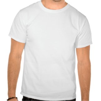
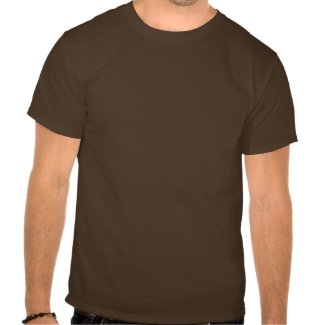
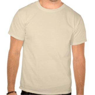
Historic Route 66 T-shirts

Holy Smacks! Summer is nearly hear, and you know what that means. T-shirt weather,of course, well actually as far as I'm concerned it's always T-shirt weather. Nevertheless, I'm pleased to announce that I'm kicking off the summer T-shirt season with a swell design inspired by the legendary Historic Route 66, sometimes called the Main Street of America. When it was first built in the 20's it stretched over 2,400 miles between Chicago and downtown LA, although it was later realigned because of traffic concerns so that  it ended at the Pacific Ocean in Santa Monica instead.

Now, you can be the first on your block to own one of these beauties, the design is available in three color choices: black, cream or brown. But that's not all, because you can customize it to fit your taste. You can put your name on the back,  resize the design, or change the shirt color. Go ahead and play around and see what you can come up with. Make it your own!

Black Design on a White Shirt

Cream Design on a Brown Shirt

Brown Design on a Natural Colored Shirt

Wednesday, May 5, 2010

Hot Rod Brain Project

I've been planning this post for a while now, but I'm still not sure how to classify it exactly. It's not in depth enough to be an actual tutorial, but it's a little more complex than just a this is the final product post. I guess you could say this is a very brief overview of  the many steps involved in an illustration project, for those who have ever wondered.
First Rough Sketch:
 The project started when I was contacted by John, one of  my Flickr friends. John does public relations and copywriting etc. and he was interested in having me do an illustration/design he could use on his web site and other collateral business items for his business Hot PR Shop . Now, John already had a really cool concept in mind, a hot rod with a brain for the engine, but if he hadn't I would have brain stormed and sketched out three concepts for him to choose from. But since he already had one, I did this first sketch based on a photo of a hot rod that he had taken at a hot rod show. At this point I wasn't too concerned with perfection, I just wanted to get all of the elements out there.


Second Rough Sketch:
Oh, I should probably mention that John and I are about 2,500 miles away, so this project was done entirely via emails and a couple of phone calls. Anyway, after I sent John the above sketch he told me what parts he liked and what parts he wanted changed. Notice that while the elements are the same at this point, yet this one is quite a different looking design. Everything is still fairly loose, I was just making sure we were on the same page.


First Digital Sketch:
In case you're keeping score at home, there were many sketches between this version and the previous one, although I didn't bother to count them, so I don't have an exact number. At this point I went from traditional media to digital and did this version based on earlier sketches. Actually, the process involved tracing parts of a couple of different sketches in Adobe Illustrator and then re-sizing the pieces to fit together. Of course, the best part about digital art  is quick editing and the ability to save multiple versions.


Early Layout Version:
This version is an early layout featuring type. While we knew what text was going to be included, John hadn't decided on the final fonts at this point, so I put these placeholder fonts in to give him an idea of how the finished product would look. While this version is a lot tighter than previous versions, I was still experimenting with certain elements, specifically the grill/engine compartment area. Somewhere along the line, the pencil had been changed to a pen, which implies a writer more than the artist feel of the pencil. I also played around with some colors, such as the green brain, and I tried a simplified version of the flames (saving a copy of the original version just in case). I used the little squares of color on the left edge to make sure all the colors were the same throughout the illustration. It's surprisingly easy get get two shades of the same color going, which can cause problems further down the line.


Final Version:
And here is the final version: the red is just slightly darker, and it's a good thing I kept a copy of the original flames because those are the ones I used. The brain is a more healthy pink color, and the grill has been brought back up in height to about the size of the original reference photo. The text is set in the fonts John chose, and I've got myself a happy client, which is a really great feeling.


Well kids, I reckon that's about it for now, thanks for stopping by.

Cheers!

Sunday, May 2, 2010

A Little Shameless Boasting

Just last month I did a job for John over at the Hot PR Shop. Well, I'm happy to tell you the he was pleased with my work, so he wrote a really nice testimonial for me, and I just wanted to share it. Thanks for the kind words, John.

And now without further ado, my first happy client testimonial. Woo-Hoo!


"Robert did a logo and some related design work for me. I got great work from him that was done in the most professional manner. Robert strove to make sure I got what I wanted (and I did), along with making changes quickly. In addition to being talented, Robert is something many designers are not - dependable. I couldn't be happier!"

For those of you keeping score at home, yes, I have mentioned doing another post on the process of the  project I did for John, and I will indeed be doing that post, I'm just getting a few other things taken care of first, but it will be coming soon.

-Cheers!

Thursday, April 22, 2010

Available Now: Nifty Retro Business Card Templates

I know what you're thinking: Jeepers! I sure wish there was a magic retro business card machine!  Well, my friend, your wish has been granted . . . or at least the next best thing. I am proud to announce that I have just released the first round of my Nifty Retro Business Card Templates over at the Vintage 66 Graphics Shop.  Like I said, this is just the first round, so there are more designs to come, as well as some other cool retro templates; promotional postcards, flyers, etc. Of course, if you don't see exactly what you like, I am available for hire to do a design just for you.


Friday, April 9, 2010

Pedal Pushers T-shirt Design

Hey, I know it has been awhile since I've posted here,  I've been really busy with some other projects, and since I've recently wrapped two of them up, I wanted to do a little boasting. This is one that I finished earlier in the week. There's a group of friends down in the East Bay area who get together and ride their vintage beach cruisers around. They call themselves The Pedal Pushers and I was aked to design a T-shirt with a retro/vintage flair for them. I'm really happy with the way the project turned out. This is the final version:


I used shirtmockup.com to show them how this design might look on a T-shirt when they get them printed up. Okay, I'm done boasting . . . for now at least.


Be sure and check out the next V66 post, I plan to go a little more in depth on another recent design I did featuring a tricked out hot rod with a brain for an engine.

Thursday, April 8, 2010

Vintage 66 Graphics: Two Years Old Today

I have to be honest, the only reason I am aware of the significance of  today's date is because I just renewed my business name. Nevertheless, two years ago today I started up Vintage 66 Graphics, incidentally, if you're wondering, the name comes from the year I was born: 1966, and my love of vintage & retro design—I like to think the graphics part is obvious. Anyway, I made this decision shortly after closing down my previous attempt at rocking the graphic design world in the form of, RNW Graphic Productions, Inc., which I had opened as a corporation on the merit some very bad advice from a very  expensive attorney, who for legal reasons shall remain nameless. I basically had two options, give up and go home, or pick myself up and try it again. As costly a mistake as that was, both financially and psychologically, I learned some really valuable lessons from the experience, and more importantly, I'm still here slugging it out, and doing just fine as a sole proprietor. So, kiss my ass Mr. Expensive-Lawyer!

Friday, April 2, 2010

Hot Rod With a Brain

Holy Mackerel! I know it's been quite a while since I've posted anything, but I've been a busy lad, in fact, I'm here to do a little boasting a bout a project I just finished up. I did this cool little illustration for John over at the Hot PR Shop. He does public relations, copy writing and whatnot, and as a matter of fact, I was just looking at his web site and it seems he's having a special for the month of April on radio ad copywriting.

Anyway, as you can see below, it features a hot rod featuring a brain for an engine. I was all set to do a post about how the project came about, although not entirely step-by-step, just a few things along the way. Sadly, I just realized that many the files (including the final T-shirt version) are way too big to be posting here, so I'll have to do that post a little later, after I have trimmed down some of the files to a more manageable size. So I guess you can think of this one as the appetizer.

Cheers!

Saturday, February 6, 2010

Somedays I Am a Bit of a Meathead!

Man Alive! For all my knowledge of graphics, digital art, and all the  files and whatnot, I'm still a bit of an old fart when it comes to modern technology. I just realized that I seem to have had the settings for my comment notifications for this blog set up in a rather wonky fashion, and consequentially, I have been completely unaware of most of the comments that have been left. So, if you were one of the kind folks who left me a comment and I didn't reply, I apologize, I wasn't trying to be a butthole. Oh, and yes, the settings have now been adjusted.

Cheers!
Robert

Phase III is Now Complete!

I hope this second month of 2010 is treating you well so far.  Woo-Hoo!  I'm doing a little horn tooting, since I just republished the latest version of the Vintage 66 Graphics Website, (the  most notable change is the addition of images to the left side bars) and it is now pretty much set for the next few months or so, although I may do some tweaking and changing and rearranging of images. Also I  plan to update the Shop Page as well as the Shop itself, soon — there are lots of exciting possibilities on both fronts, as well as some surprises. In the meantime, I'm truly happy with the web page layout itself, and I'm excited to be moving on to phases IV and V, as well as publishing some posts on my badly neglected Sketchblog.

Thank you for taking the time to read my blog, have a great weekend.

Cheers!
Robert

Monday, February 1, 2010

Graphic Design Snafu

I just wanted to show off a perfect example of how to do it wrong. I think screwing up a job this bad is every graphic designer's worst nightmare, although there are a lot of hacks out there who call themselves designers who would have no problem with it, as long as the check cleared—god damned Mac-Monkeys. Do you know what else amazes me? Someone actually signed off on this job, in other words, someone with a lot of money saw this mess in the planning stage and said: Golly, this looks swell, here's a big check. Unless  Megaflicks offers nothing but porn, this gaff should have been caught long before it got to this stage. I'm just sayin'.

demotivational posters
see more deMotivational Posters

Sunday, January 31, 2010

Done With Phase II

Woo-Hoo! Just a little 2 AM boasting. I just finished up phase 2 of the almighty 2010 website update, which mainly consisted of rewriting most of the text for the contact page and the home page. I also added a contact form, which I'm quite pleased with, and I'm starting to add some images to the left side bar (only on the home page at this point). The other pages are still under consideration, but there could be some big changes, and there is also the possibility of the addition of either an FAQ or About page. Now, there's something to write home about!

Sunday, January 24, 2010

Vintage 66 Website Updated

Heavens to Murgatroyd, I just finished  phase one of the design update for the Vintage 66 Graphics website. The most obvious change is the new header, which has also been added right here to the V66 News Blog, and the V66 Zazzle Shop, and is based on the new 2010 business card design. I was originally planning to change to an entirely different color scheme, but in the process of playin' around, I came up with this version that I'm really pleased with. If you're wondering, the three-tone lightning bolt design was inspired by a vintage trailer that is parked not far from my house.

Wednesday, January 6, 2010

Art Dork Extraordinaire

I'm just doing a little boasting for now, and showing off my new business card design for 2010. I'm still in the planning stage for the new year, but I'll be back soon with an update of what you can look forward to—because I know you're waiting with baited breath. Cheers, for now, and comments are always welcome.